Start with the task, not the decoration
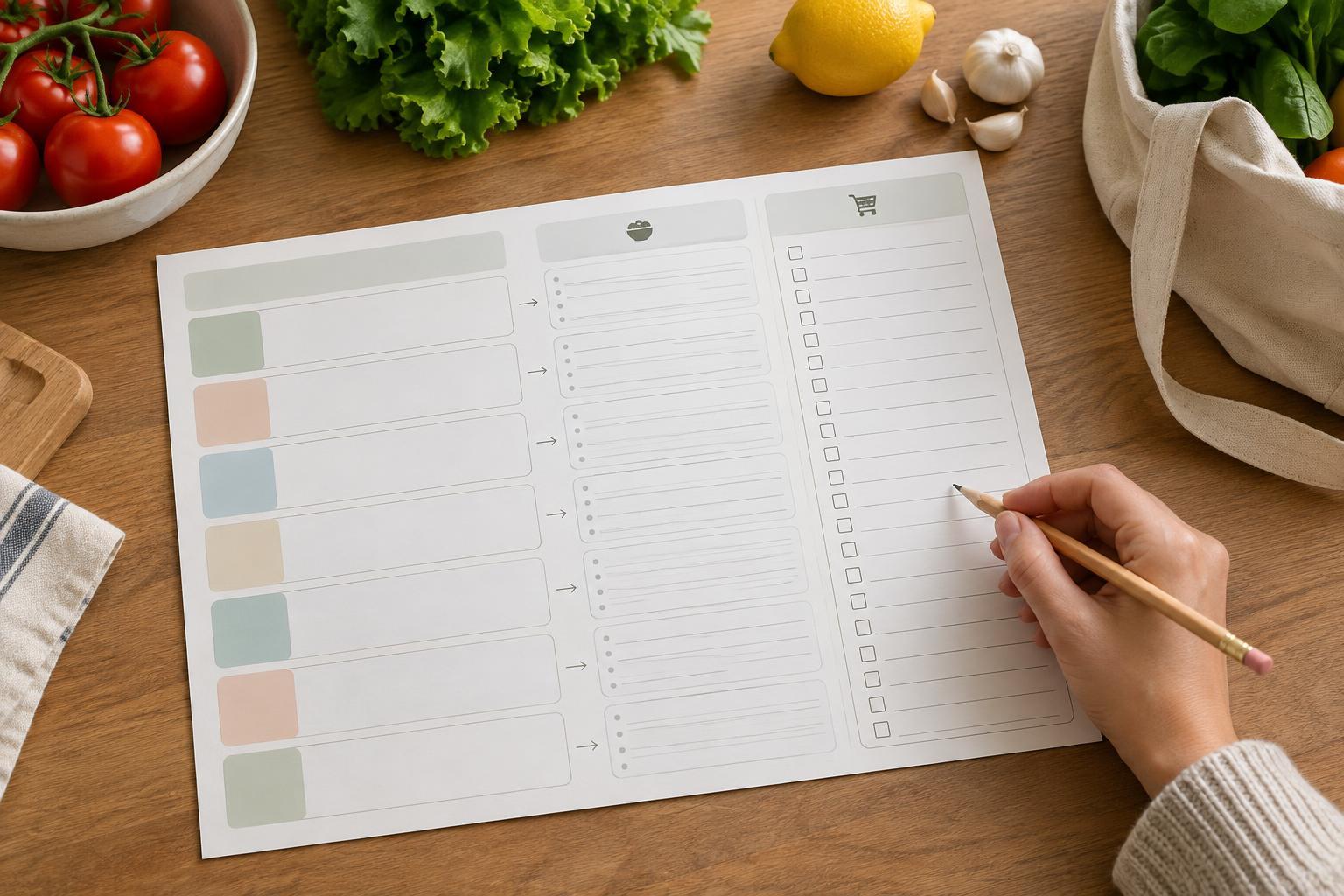
The main job of a meal planner is to answer two questions: What are we eating, and what do we need to buy? Design the page around the movement from the first answer to the second. If someone has to flip between unrelated boxes or remember every ingredient while filling out the list, the connection is too weak.
Before drawing a layout, decide how the planner will be used. A single weekly page might include seven days, a shopping list and a small space for items already on hand. If there are several meals to plan each day, keep the day labels but allow more writing room. For a compact printable, planning one main meal per day may be more useful than squeezing breakfast, lunch, dinner and snacks into tiny boxes.
Build a clear path from meals to ingredients
Place the meal schedule on the left or at the top of the page, followed by a clearly titled shopping list. This creates a natural reading order: choose meals, check ingredients, then write down what is missing. A short instruction such as “Check what you have before adding items” can clarify the process without taking over the design.
Give each day a consistent space with a label and room for a meal name. A narrow notes line beside it can hold a useful reminder, such as “use leftover rice” or “make extra for lunch.” Keep these notes separate from the shopping list: they describe the plan rather than an item to purchase.
For example, someone planning pasta with a vegetable sauce can write the meal under Tuesday, check the pantry for pasta and add only the missing vegetables to the list. When another meal uses the same vegetables, the list remains one place to record them rather than a separate list for each day. That is the connection the layout should make easy.
Make the shopping list easy to scan
Divide the shopping area into a few broad groups, such as Produce, Pantry, Chilled and Other. These labels can help someone find items while shopping, but too many categories leave little room to write. If the page is meant for a household with different habits, use generous blank lines and simple headings rather than prescribing a detailed system.
Leave enough width for an item and, when useful, a quantity. A checkbox beside each line can support checking items off, but it should not crowd the writing space. If the list is likely to be cut away and carried separately, give it a clear dividing line and repeat a small heading at the top of that portion. If it will stay attached, avoid a cut line that suggests a feature the layout does not need.
Consider a small “Already have” area near the shopping list. It can hold ingredients that matter to the plan but do not need buying. Keep it noticeably smaller than the purchase list so the page still emphasizes the action it is meant to support.
Use typography and spacing to support handwriting
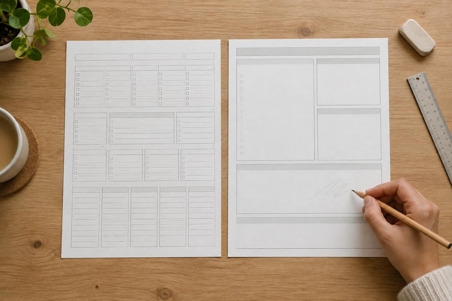
A printable needs to work after ink meets paper and pen meets page. Use distinct type sizes for the page title, section headings and day labels, while keeping labels comfortably readable. Let spacing and alignment do most of the organizing; heavy borders around every field can make a practical worksheet feel cramped.
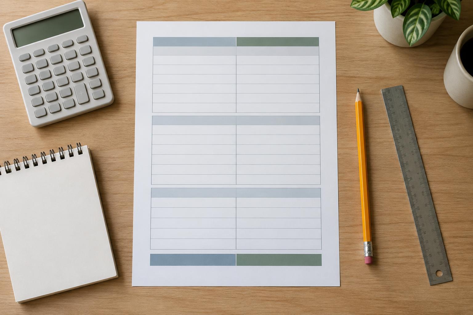
Choose light rules or open white space for writing areas, and keep text and essential lines dark enough to remain visible on an ordinary home printout. Color can distinguish the meal plan from the shopping list, but it should not be the only signal. Clear headings and a consistent grid will still make sense if the page is printed in grayscale.
Check the page at its intended paper size rather than judging only from a zoomed-in screen view. A shopping line that looks spacious on a monitor may be too short for “tomatoes, six” when printed. Leave margins so content is not uncomfortably close to the paper edge.
Test the planner with a realistic week
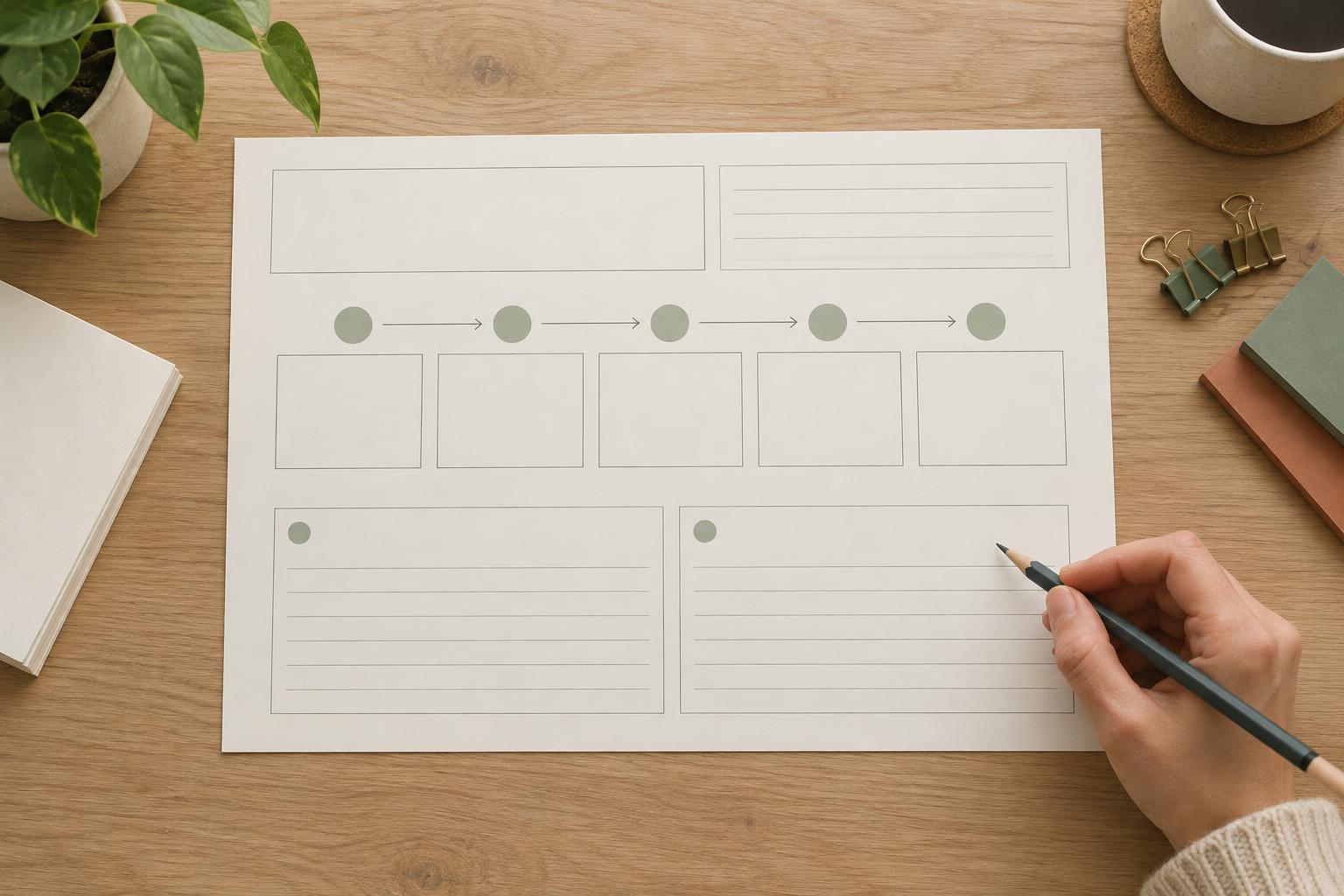
Fill in a draft before treating the layout as finished. Choose several meals that share ingredients, one meal that uses something already on hand and a day that needs a short preparation note. Transfer the missing ingredients to the shopping list. Notice where you pause: a pause may reveal an unclear label, a list that is too small or a notes area in the wrong place.
Then print a test copy, write on it and make one focused revision at a time. You may find that the planner needs fewer decorative elements, wider list lines or more space for weekends. The goal is not to capture every possible food-related detail. It is to make the everyday sequence—plan meals, check supplies, list what is missing—simple enough to repeat.