
Social GraphicsA useful FAQ graphic helps someone find an answer without reading a dense block of text. Learn how to choose the right question, organize the answer, and check that the design still works on a small screen.
Read article · 4 min↗

Social GraphicsA social graphic can look clear on a desktop and become difficult to read when it appears at phone size. Learn how to spot problems with type, contrast, cropping and crowded layouts before you post.
Read article · 4 min↗
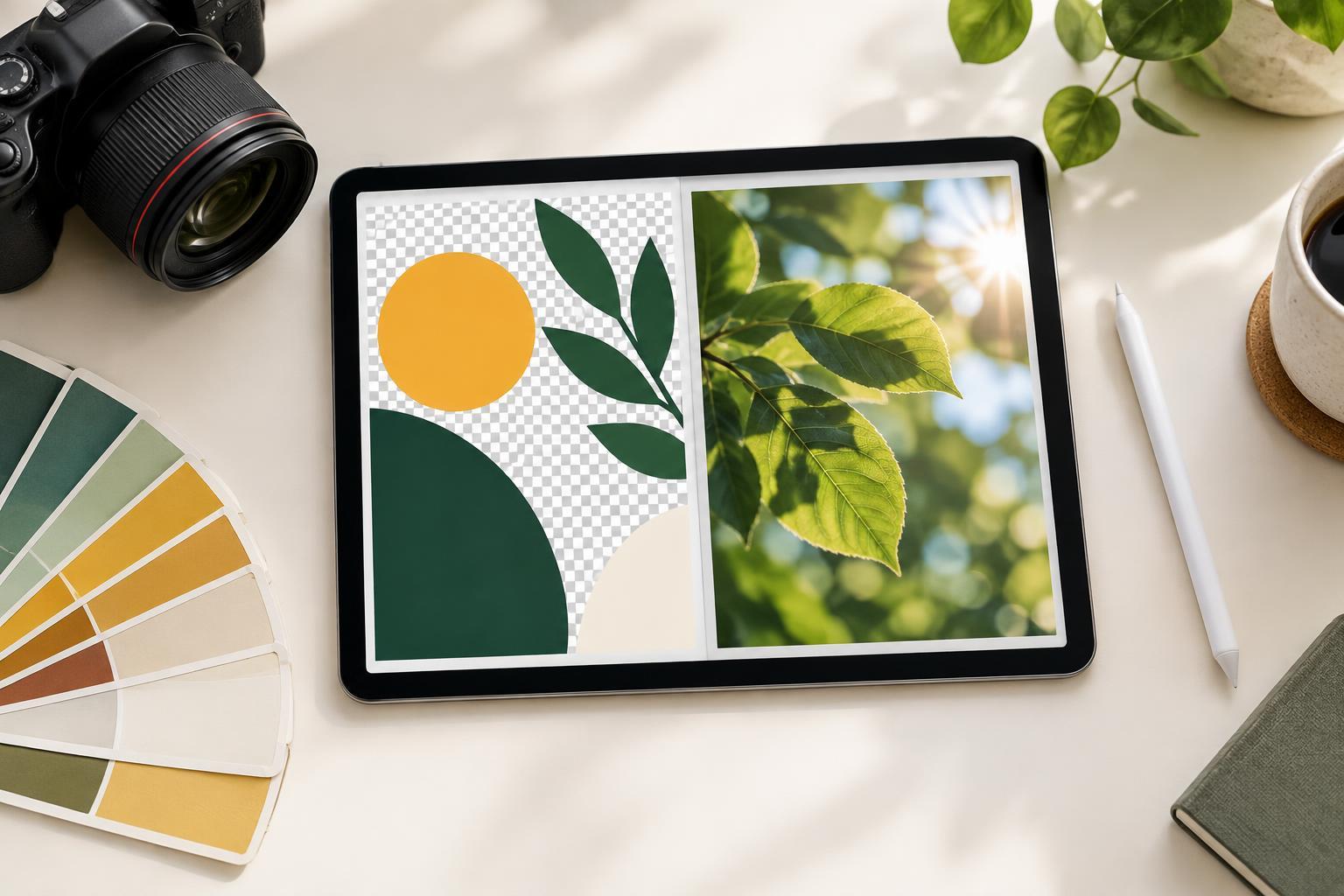
Social GraphicsPNG and JPEG can both work for social graphics, but they preserve different things. Learn when to use PNG for crisp text and transparent elements, when JPEG suits photographs, and how to check an export before posting.
Read article · 4 min↗

Social GraphicsSocial graphics often combine a photo, illustration, headline, and small details. Learn how to write alt text that preserves the message, describes useful visual context, and avoids repeating the entire caption.
Read article · 5 min↗
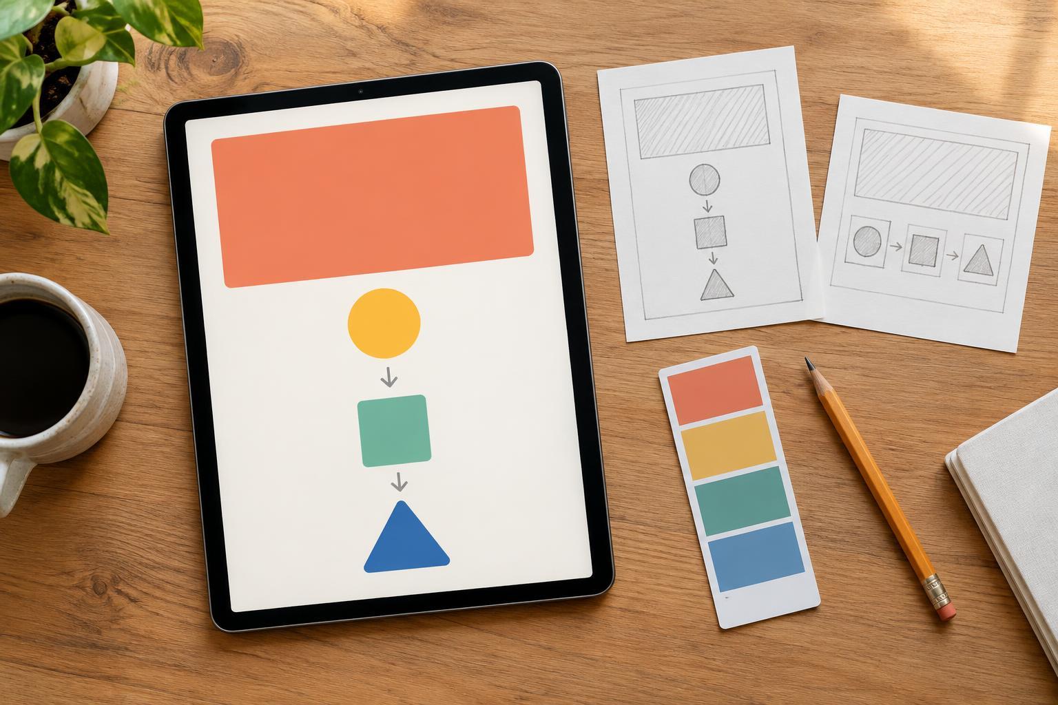
Social GraphicsA useful tip can get lost when it is squeezed into a graphic without a clear reading path. Learn how to shape one idea into a headline, a few easy-to-follow steps and a simple visual layout that works at small sizes.
Read article · 4 min↗

Social GraphicsA single number can make a social graphic easy to scan, but the design choices around it shape what viewers take away. Learn how to choose an accurate headline, show essential context, avoid misleading visuals and check the graphic before publishing.
Read article · 4 min↗

Social GraphicsA quote card works best when people can read the words quickly and understand who said them. Learn how to choose a short quote, build a clear type hierarchy, credit the source responsibly, and check the design at the size people will actually see.
Read article · 4 min↗

Social GraphicsA social graphic often needs to communicate an idea and invite a next step. Learn how to give the main message priority while making the call to action clear, readable and easy to find.
Read article · 4 min↗
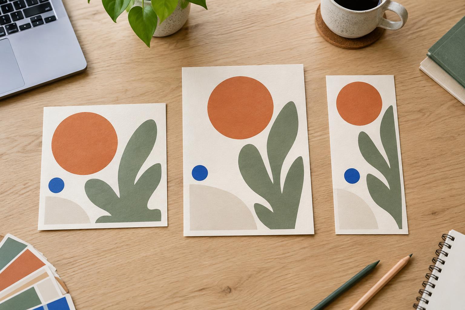
Social GraphicsA square post, portrait post, and story can share the same visual idea without using the same layout. Learn how to keep your message consistent while adjusting hierarchy, imagery, spacing, and text for each shape.
Read article · 4 min↗

Social GraphicsA recurring social series is easier to recognize and produce when each post follows a small set of design rules. Learn how to define its visual identity, build flexible layouts, handle different content lengths, and check each graphic before publishing.
Read article · 4 min↗

Social GraphicsA lively photo can make a social post stand out, but competing shapes and colors can make its message hard to read. Learn how to choose a text area, create contrast, style the type, and check the finished graphic at a small size.
Read article · 4 min↗

Social GraphicsA good crop makes the subject easy to see while leaving room for the message. Learn a practical workflow for choosing a canvas, positioning the photo, protecting important details and checking the finished graphic.
Read article · 4 min↗

Social GraphicsA video cover should give viewers a useful clue even when the platform title is hidden, cropped, or too small to read. Learn how to choose a clear visual subject, arrange it for different screen sizes, and test whether the image communicates on its own.
Read article · 4 min↗

Social GraphicsA text overlay has to work with an image and make sense at a small size. Learn how to choose one clear message, trim the wording, break lines deliberately, and check readability before posting.
Read article · 4 min↗

Social GraphicsA carousel should make it easy to notice that more slides follow and to understand where you are in the sequence. Learn how to use slide numbers, directional cues and consistent placement without competing with the content.
Read article · 3 min↗

Social GraphicsA useful carousel does more than divide information into slides. Learn how to shape one idea into an opening that sets expectations, a middle that builds understanding, and an ending that gives readers a clear next step.
Read article · 4 min↗

Social GraphicsA profile header can look balanced on a wide desktop screen but lose its headline or focal point on a phone. Learn a flexible layout process that keeps essential content visible, gives imagery room to crop, and makes testing part of the design.
Read article · 4 min↗

Social GraphicsA profile picture may look polished on a full-size canvas but disappear when shown beside a comment. Learn how to choose a clear subject, simplify details, use color and contrast deliberately, and test your design at the sizes people are likely to see.
Read article · 4 min↗

Social GraphicsA feed post and a story graphic can share the same message without using the same layout. Learn how to adjust hierarchy, spacing, text, and imagery so each version works in its viewing context.
Read article · 4 min↗

Social GraphicsCaptions, buttons, profile details and playback controls can cover parts of a social graphic. Learn how to plan flexible safe areas, place text and calls to action, and check designs before posting.
Read article · 4 min↗

Social GraphicsA practical guide to choosing canvas shapes for social graphics. Learn when square, portrait, vertical, and wide layouts make sense, and how to adapt one design without awkward crops.
Read article · 4 min↗