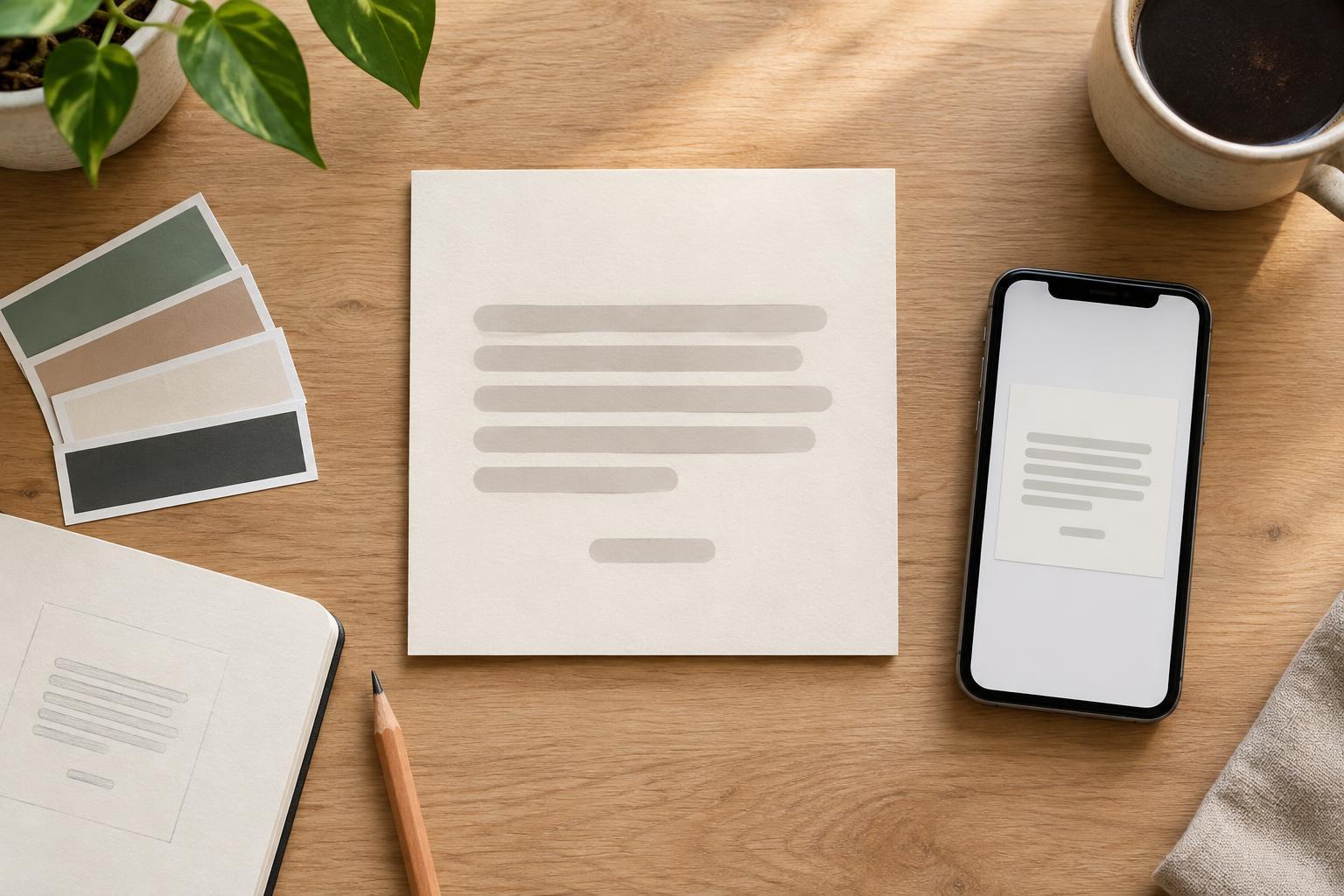
Start with the quote, not the decoration
Before opening a design tool, decide what the card needs to communicate. A short quote usually has more room to breathe than a long passage, especially on a phone screen. Read the words aloud and identify the phrase that carries the main idea. If the quote needs extensive context to make sense, it may be better suited to a caption or a longer post than to a standalone graphic.
Check the wording and the speaker before you design around them. Keep the quotation faithful to its source, and do not attach a name simply because a saying is commonly attributed to that person. If you cannot confirm an attribution, choose a different quote or clearly describe the text in another way, such as an original thought from your own account. For work you do not own, consider whether you have permission to reproduce it; a name on the card is a credit, not permission.
Give the words a clear reading order
A useful quote card has two main text levels: the quote and its attribution. Make the quote prominent, then set the speaker’s name smaller but still easy to read. If you add a job title, book title, account name, or other context, give it a third, quieter level. Avoid making the attribution so faint or tiny that someone has to zoom in to identify the speaker.
Choose a typeface that remains legible at the card’s intended display size. Decorative lettering can add character, but it is harder to read across a full sentence. Try one expressive style for a brief emphasis and a simpler style for the remaining text. Limit the number of typefaces and weights so the hierarchy comes from a few deliberate choices rather than competing effects.
Use spacing and contrast to support the text
Give the quote a comfortable margin on every side. A narrow text block can create awkward line breaks, while a very wide one can make it difficult to move from one line to the next. Adjust the text box until the lines form natural phrases, and avoid leaving a single short word stranded on its own line when a small change to width or type size would fix it. Leave a visible gap before the attribution so it reads as a credit rather than part of the quote.
The background should help the words stand out, not ask for equal attention. A plain color or subtle texture is often easier to work with than a busy photograph. If you use an image, place the text over a calm area or add a solid or translucent panel behind it. Check that every word, including the attribution, has enough contrast against its immediate background. Shadows and outlines may help in some cases, but they are not a substitute for a dependable light-and-dark contrast.
Make the attribution specific and honest
Place the speaker’s name close enough to the quote that the relationship is obvious. A dash, a separate line, or a small label such as “Quoted from” can work; consistency matters more than the particular convention. When the speaker and the original work are both relevant, distinguish them. For example, a character’s line may need the character’s name and the work’s title rather than an unexplained author name.
Keep supporting details accurate and proportionate. Do not use a logo, portrait, or handle to imply endorsement. If the precise source is useful but too long for the card, put the fuller context in the accompanying caption and keep a concise credit visible on the graphic. That way, the card remains understandable if it is viewed separately from your post.
Check the card at real viewing size
Before exporting, shrink the design to roughly the size it might appear in a feed. Can you read the quote without zooming? Can you identify the speaker immediately afterward? If not, enlarge the type, shorten the text, simplify the background, or remove nonessential decoration. Keep important text away from the edges so it has room if a platform crops the preview differently from your design canvas.
Do one final text check after the visual check. Compare the quote and name with the version you verified, look for missing punctuation, and confirm that deliberate line breaks have not changed the meaning. If you publish with a caption, consider including the quote and attribution there as text as well. A strong card should look considered, but its first job is simple: let people read the words and know where they came from.