Start with the decisions the page needs to support
A packing checklist should help someone decide what to bring, confirm what has been packed, and notice what still needs attention. Before arranging boxes on a page, decide whether the checklist is for one person or a group. A family list may need a column for each person, while a single-person list can give more room to notes and quantities. Trying to serve both purposes on one crowded page can make the checklist harder to use.
Keep the trip details small but visible at the top: destination, departure date, number of nights, and a brief note about expected activities. These fields give context when someone revisits the page during packing. Avoid building the whole layout around one kind of trip. A flexible checklist should have enough structure for familiar essentials and enough blank space for unusual plans.
Group items by where people will look for them
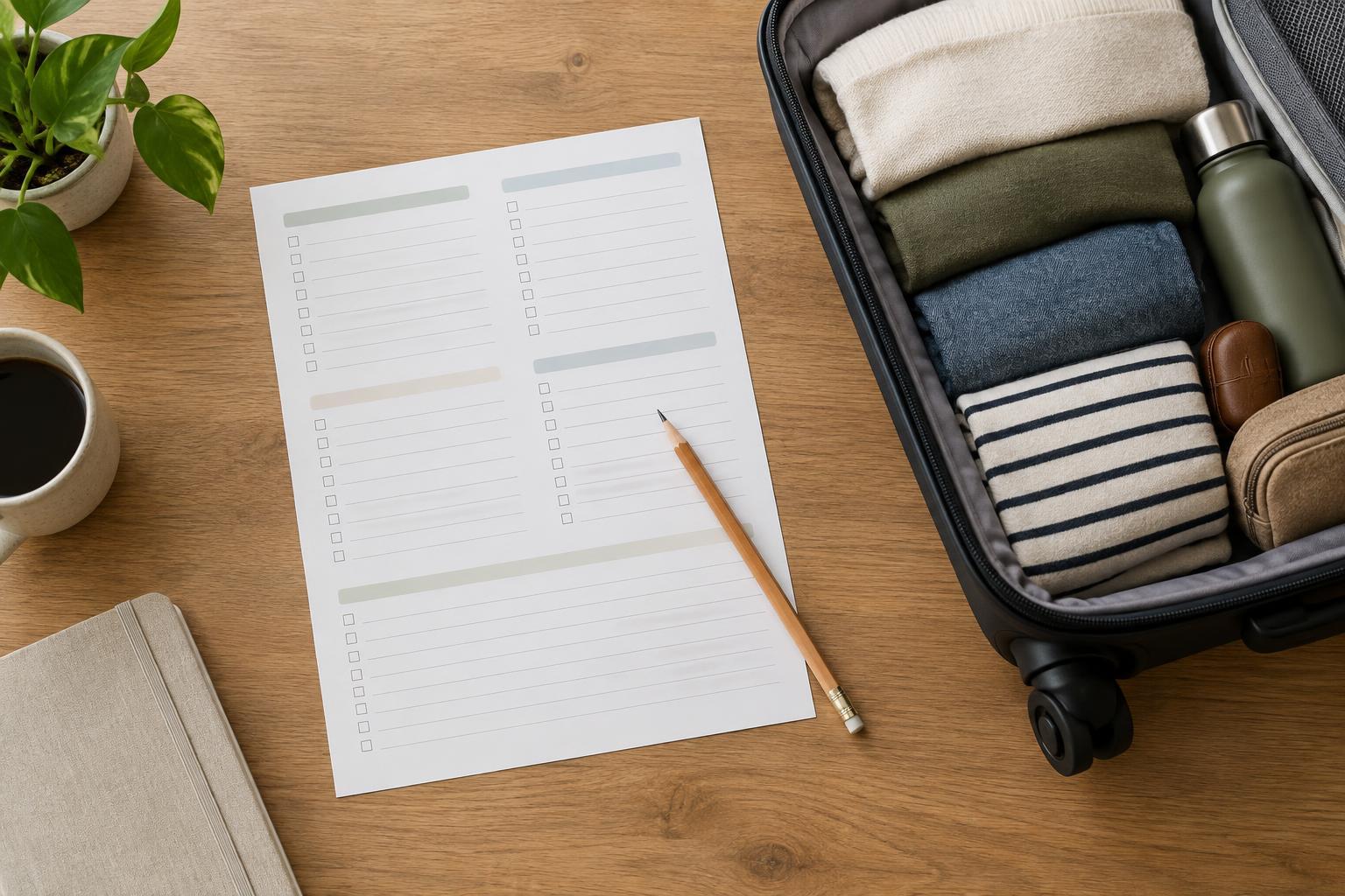
Choose a few broad categories, such as clothing, toiletries, documents, devices, and items needed during travel. Category labels make a long list easier to scan than one uninterrupted column. Put related entries together and use everyday names: “phone charger” is easier to check quickly than a vague label such as “electronics accessory.” If a category has many entries, split it into smaller groups only when the distinction helps someone find things faster.
Consider the order in which the checklist will be used. Documents and travel-day items may deserve a prominent position because they are easy to leave until the last minute. Clothing may need more space because quantities vary. An “add your own” area within each category can work better than a single blank section at the bottom: people can record a rain jacket beside clothing or a special cable beside devices without hunting for the right note later.
Make the marks meaningful
A single checkbox is enough when the only question is whether an item is packed. If the page must also support shopping or preparation, add a separate, clearly labeled mark such as “need to get.” Do not place several tiny unlabeled squares beside every item; users should not have to remember what each square means. A short key near the top can explain a two-mark system without repeating long instructions throughout the list.
Some items call for a quantity rather than a yes-or-no answer. A small blank beside “shirts” or “pairs of socks” lets the user set a target for this trip. Keep that blank distinct from the packed checkbox so a written number cannot be mistaken for a completion mark. For shared trips, a narrow initials column can show whose item it is, but test whether that extra column leaves enough room to write comfortably.
Balance ready-made prompts with open space
Preprinted entries save time, but a checklist filled with highly specific suggestions can become distracting. Include common prompts that are easy to understand, then leave lines for items that depend on the destination, activities, weather, or personal routines. A section labeled “Before leaving” can hold tasks such as charging a device or checking travel details; keep these separate from objects that go into a bag.
Give blank lines roughly the same height as the preprinted entries. If the spaces for custom items are much smaller, the page may look flexible without being practical. Avoid faint decorative writing lines that disappear when printed or heavy rules that compete with handwriting. Clear category headings, modest spacing, and consistent checkbox placement do more for usability than extra ornament.
Test the page as a working checklist
Print a draft at the size you expect people to use, then fill it out for a hypothetical short trip and a longer one. Check whether there is enough room for quantities, whether categories are easy to find, and whether the checkboxes are large enough to mark with a pen. If both examples need many additions in the same place, consider giving that category more open lines rather than adding a long list of niche items.
Finally, look at the page in grayscale and from an ordinary reading distance. The checklist should remain understandable without color, and no essential label should rely on a pale tint. If the draft feels cramped, remove low-value prompts before shrinking the type. A good packing checklist does not try to predict every trip; it makes the recurring decisions clear and leaves room for the details that change.