Give repetition a job
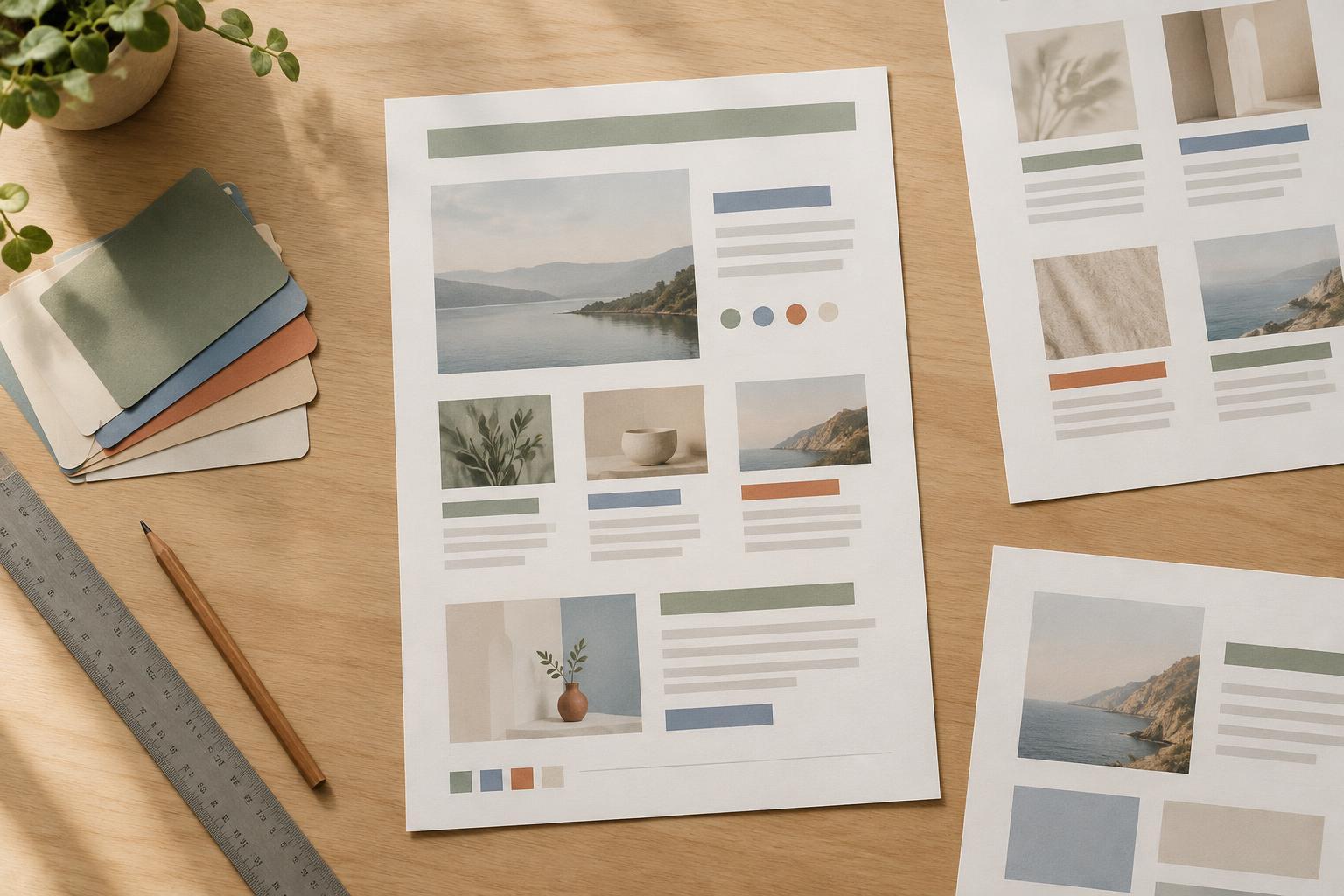
Repetition makes a layout easier to understand. When headings share a style, readers can recognize a new section before they read its words. When related items use the same spacing, those items begin to feel like a set. The goal is not to make every part of a page identical. It is to make recurring elements behave predictably.
Start by identifying what the reader will encounter more than once: section headings, body paragraphs, captions, page numbers, cards, or callouts. Assign each kind of content a consistent treatment. A section heading might always use the same type size and weight, with the same amount of space above it. A caption might always sit directly below its image in a quieter text style. These choices create a pattern that helps readers find their way.
Keep the system small enough to remember. If five headings that serve the same purpose each have a different color, size, or alignment, readers must work out whether those differences mean anything. If they do not, simplify them.
Repeat relationships, not just decorations
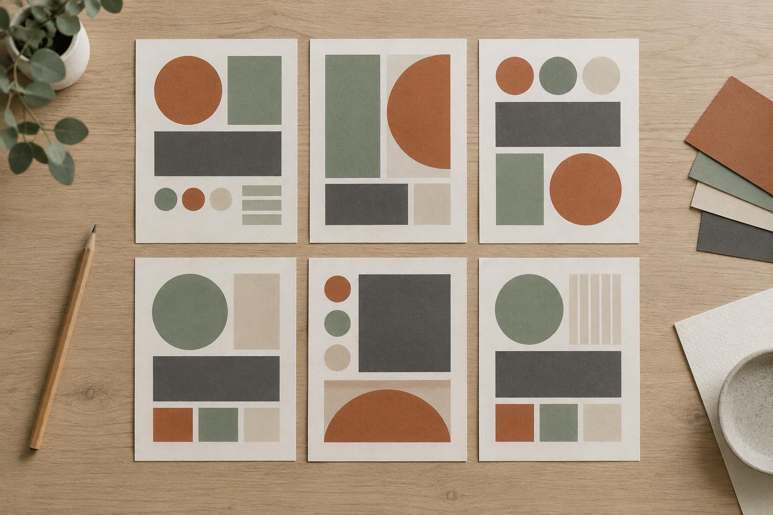
A repeated shape or color can help a design feel cohesive, but repeated relationships often do more work. Think about the distance between a heading and the paragraph it introduces, the position of a label within a card, or the way images align with nearby text. Those decisions establish a rhythm even when the content changes.
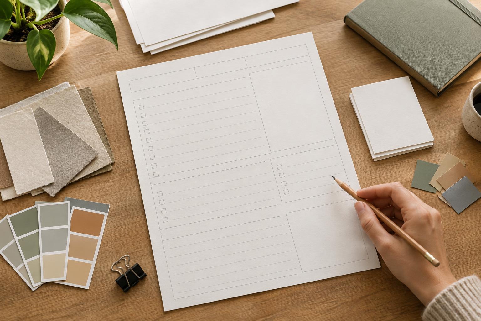
For example, imagine a printable planner with several task areas. Each area has a label, writing space, and a small note prompt. Give the labels one shared style and place each prompt in the same position relative to its writing space. The areas can vary in height according to their purpose while still feeling like parts of one page. Consistency comes from how the pieces fit together, not from forcing every box to be the same size.
Color and pattern can reinforce that structure when used with restraint. A repeated accent color might mark each new section, while a pattern stays in margins or other areas that do not compete with text. If you want to browse visual ideas for repeated accents, Colour and Pattern · The Expression Edit offers another place to explore color and pattern as design elements.
Introduce variation where it carries meaning
Once the recurring elements are consistent, decide what deserves to break the pattern. A key instruction, a deadline field, or the main takeaway on a presentation slide may need more emphasis than surrounding material. Give that element one deliberate difference, such as a stronger weight, a contrasting background, or more space around it.
Variation works best when readers can infer a reason for it. If every card has a colored border except one, that card will attract attention. Use the exception for information that merits it. If the border changes color at random, the same difference becomes distracting. Before adding a flourish, ask: does this help someone identify, compare, or remember the content?
Consider how a distinctive accent works within an otherwise coordinated set of clothing: it stands out partly because the surrounding choices hold together. For more visual inspiration on accents that draw attention, you can browse Statement Accessories · The Expression Edit. In a layout, let an accent play a similarly focused role rather than giving every element its own competing highlight.
Test the pattern with real content
A system that looks tidy with placeholder text may feel cramped once real words and images arrive. Fill in a short heading, a long heading, a brief paragraph, and a fuller one. Check whether the repeated styles still make their roles clear. Adjust the underlying rule if necessary instead of making a separate fix for each instance.
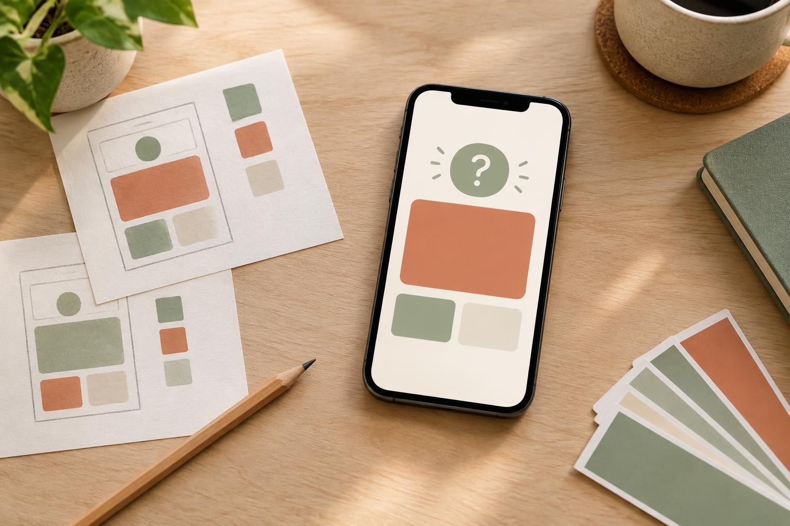
Then scan the page without reading every word. Can you quickly spot where sections begin? Do similar items look related? Is the most important exception easy to find? If everything seems equally prominent, reduce the number of accents. If the page feels too uniform, strengthen one meaningful contrast rather than changing several styles at once.
Finally, review the layout at the size in which someone will use it. A detail that looks subtle on a large screen may disappear on a phone or in print. Repetition should remain clear at that size, while variation should guide attention without interrupting the reading path.