Layout and TypographyA layout that looks balanced with sample copy can fall apart when a heading grows or a description shrinks. Learn how to plan flexible text areas, set limits, and test a design with realistic content before reusing it.
Read article · 4 min↗
Layout and TypographyTypography can make a good layout feel confusing or clear. Learn how to spot common mistakes with font choices, hierarchy, spacing, alignment and readability, then fix them in presentations, planners and social graphics.
Read article · 4 min↗
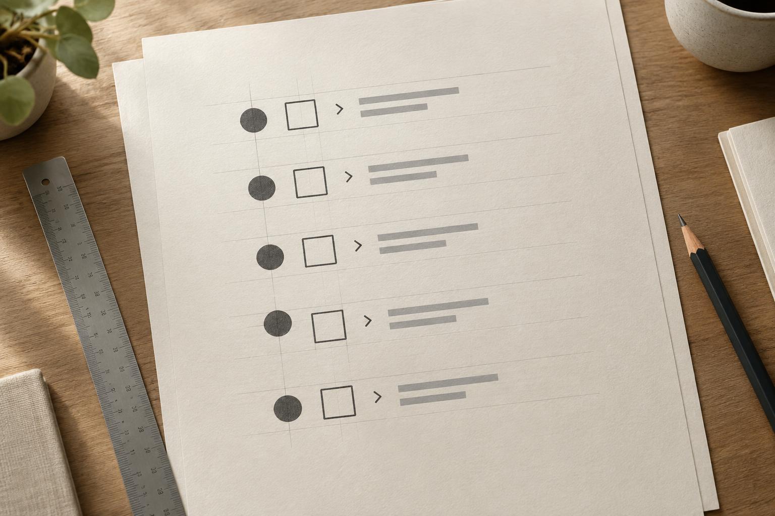
Layout and TypographyA text label and icon can share the same alignment guide yet still look slightly off. Learn why font metrics and icon shapes create visual gaps, then use a repeatable method to align them without losing consistency.
Read article · 4 min↗
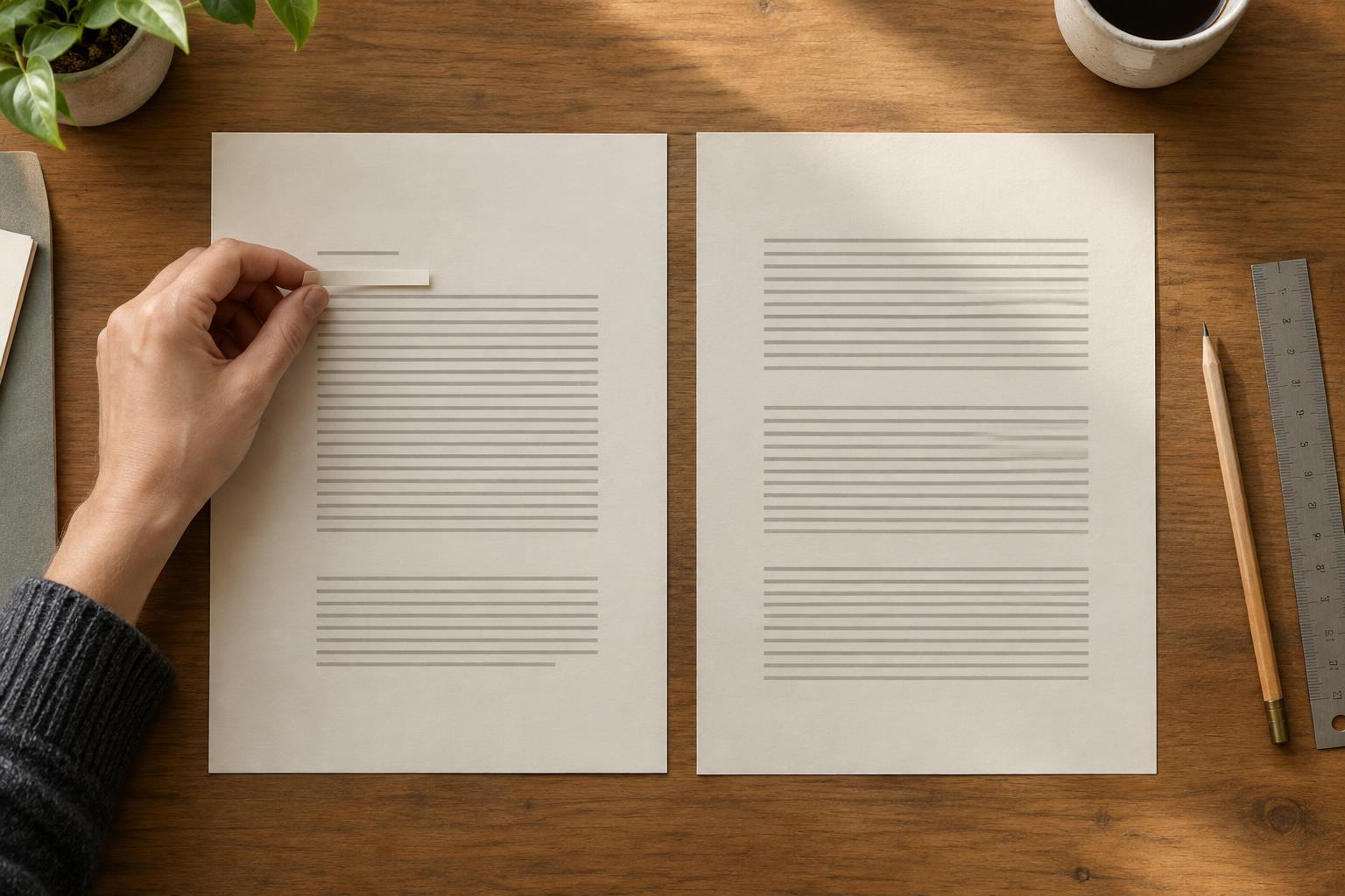
Layout and TypographyA single word stranded at the end of a paragraph or the top of a page can make a layout feel unfinished. Learn how to spot awkward line breaks and fix them in presentations, planners, and other designs without disrupting the rest of the page.
Read article · 4 min↗
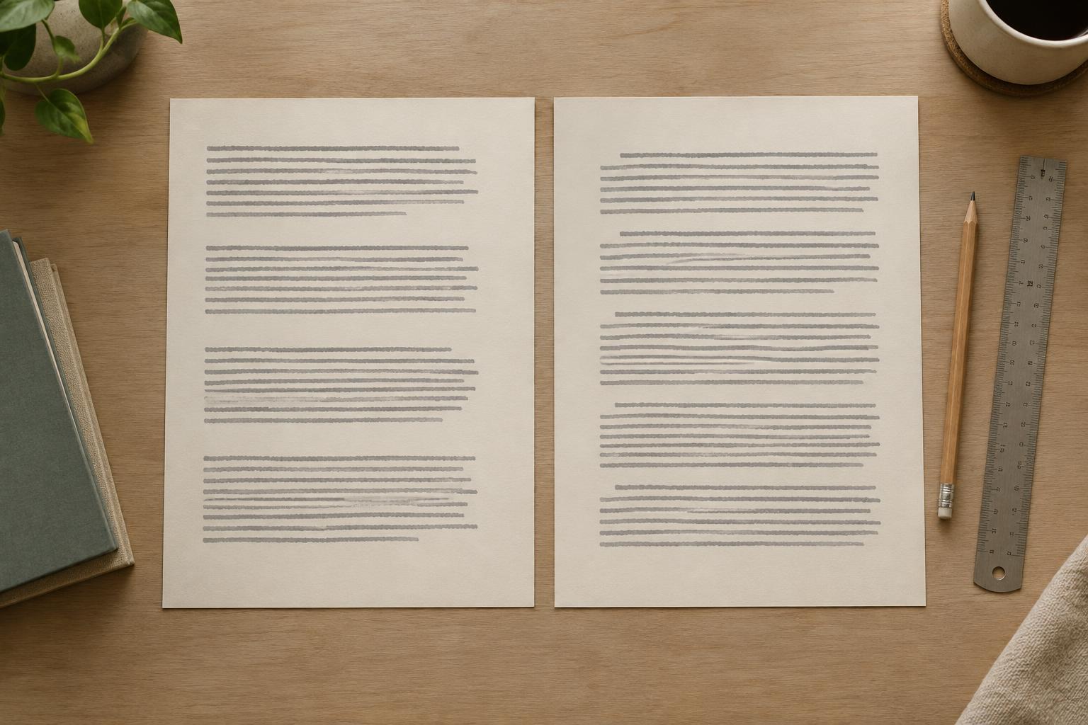
Layout and TypographyParagraph spacing and first-line indents both show where a new paragraph begins. Learn when to use each, how to set them consistently, and why combining them often makes a layout feel uneven.
Read article · 3 min↗
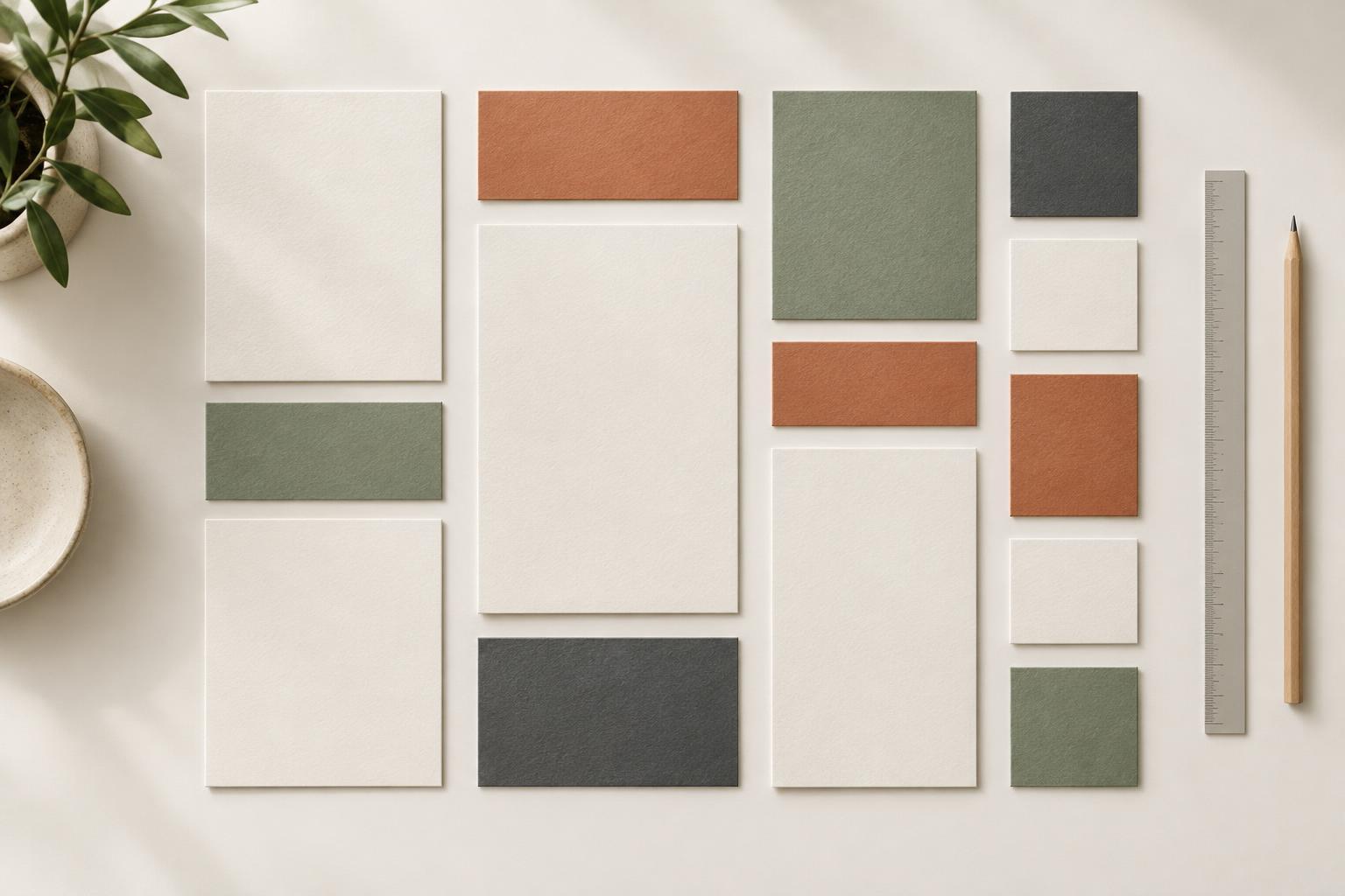
Layout and TypographyA spacing scale gives you a small set of repeatable gaps instead of a new measurement for every element. Learn how to choose one, apply it to text and groups, and adjust it across presentations, printables, and digital graphics.
Read article · 4 min↗

Layout and TypographyText-and-image layouts work best when both elements have a clear job and enough room to do it. Learn how to choose proportions, protect readable text space, align the two elements, and adapt the layout when the available space changes.
Read article · 4 min↗
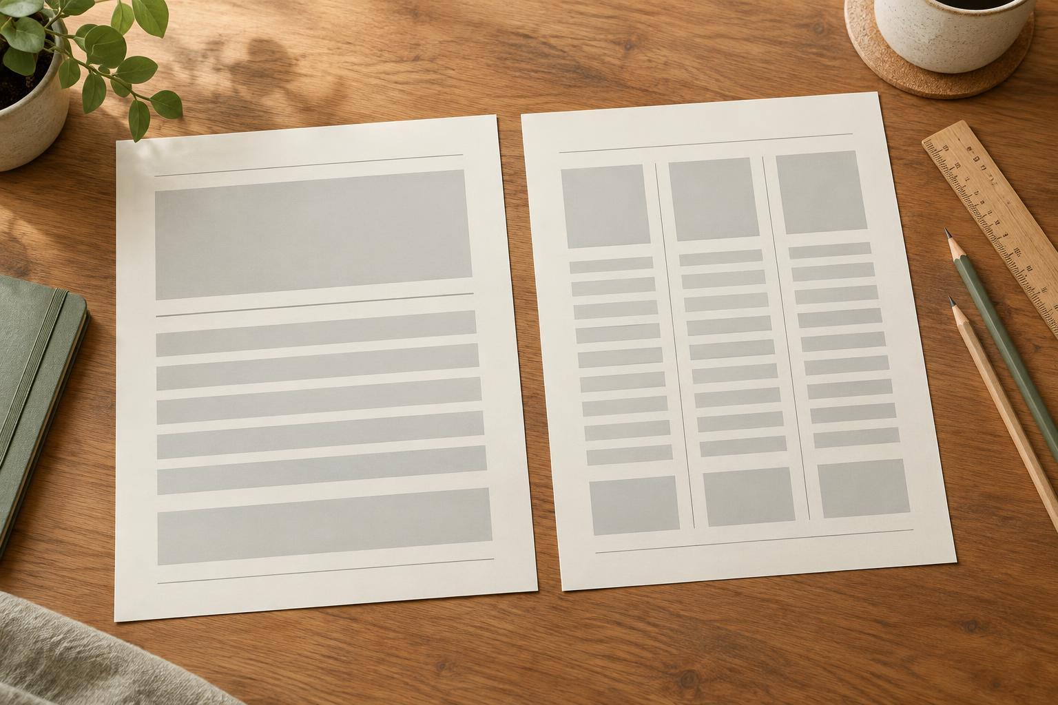
Layout and TypographyA single column gives content a clear reading path, while multiple columns can make comparisons and repeated items easier to scan. Learn how to choose a structure based on the reader’s task, the amount of content and the space available.
Read article · 4 min↗
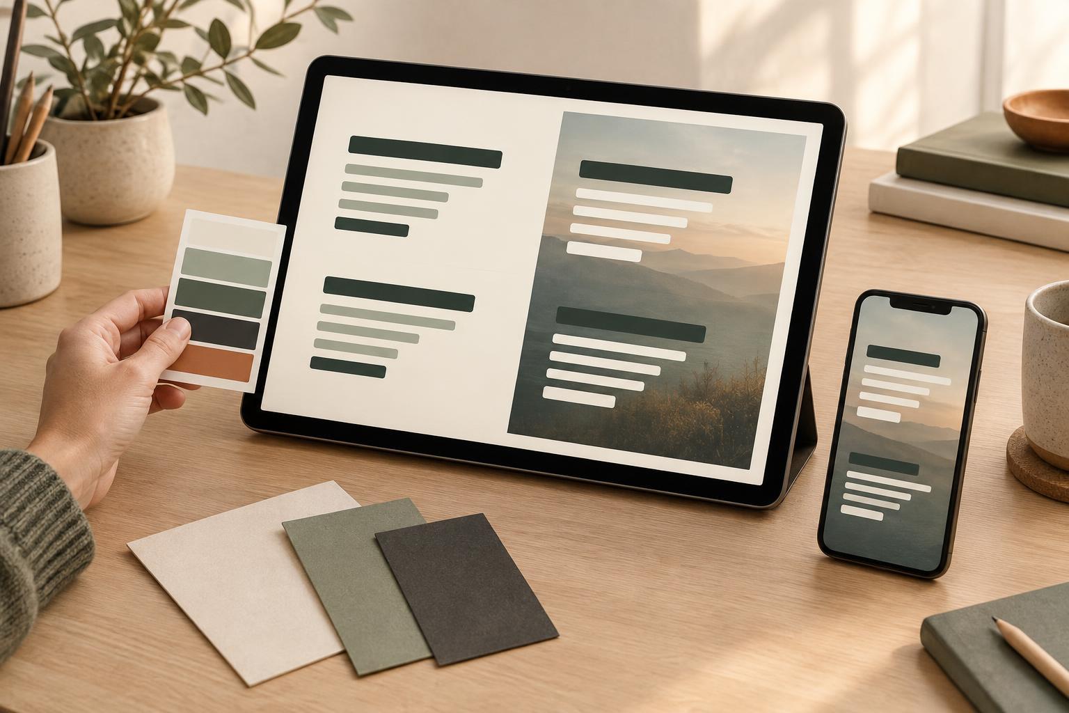
Layout and TypographyText can look clear at full size and become difficult to read in a thumbnail, on a phone, or over a busy image. Learn how to check color contrast, test the actual background behind each line, and make practical fixes without losing your design’s character.
Read article · 4 min↗
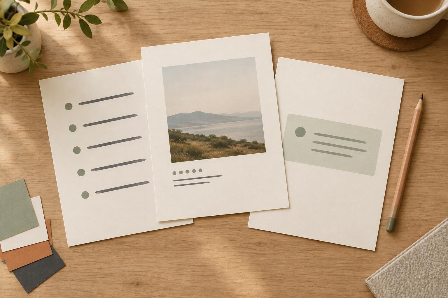
Layout and TypographyLists, captions, and callouts often appear in the same presentation, planner, or digital graphic, yet each has a different job. Give them clear roles, repeat a few formatting rules, and check them in context to make your layouts easier to scan.
Read article · 4 min↗
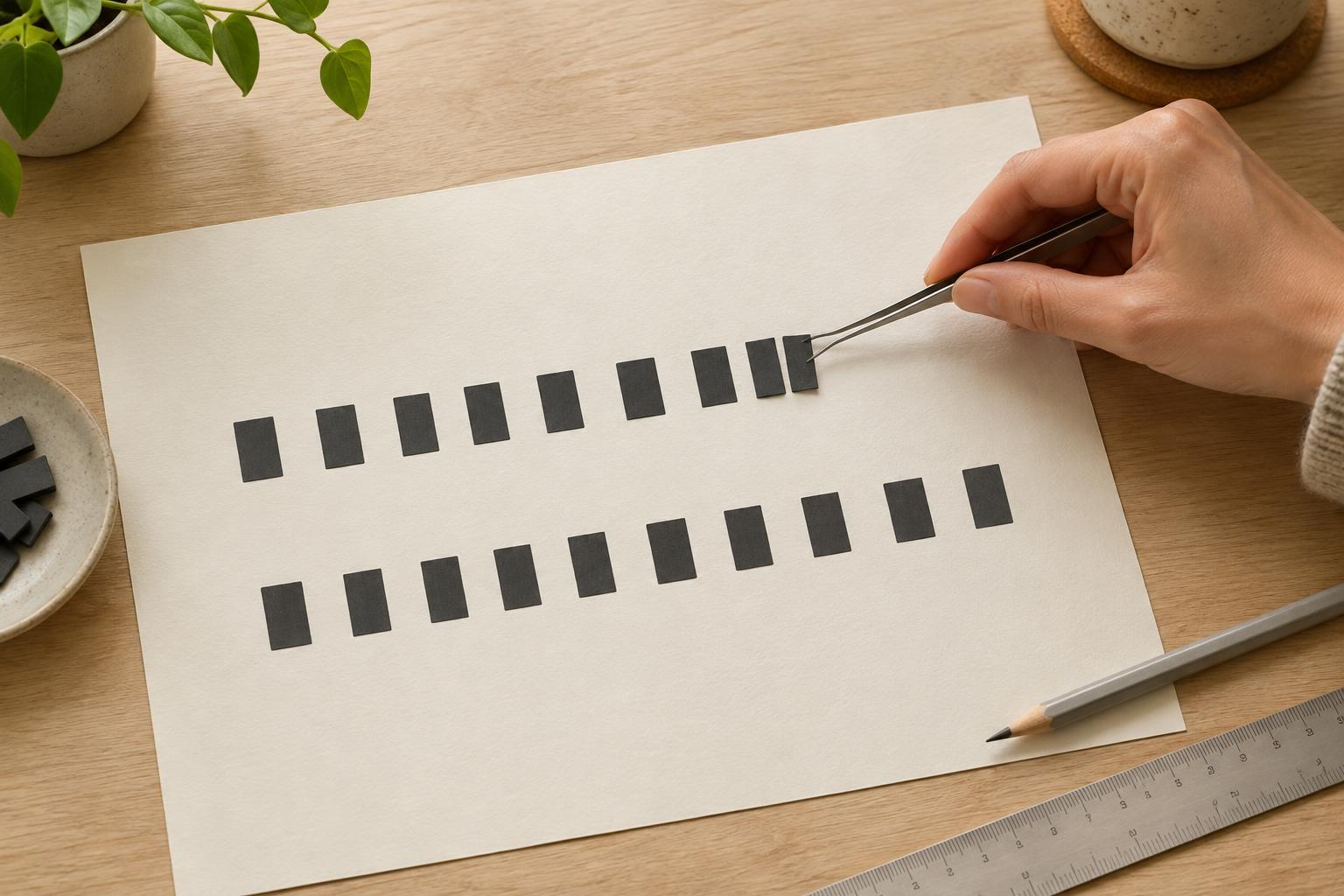
Layout and TypographyKerning fixes the space between particular pairs of letters; tracking changes spacing across a selected range of text. Learn when each adjustment helps, how to spot uneven spacing, and how to keep headings, slides, and printables readable.
Read article · 4 min↗
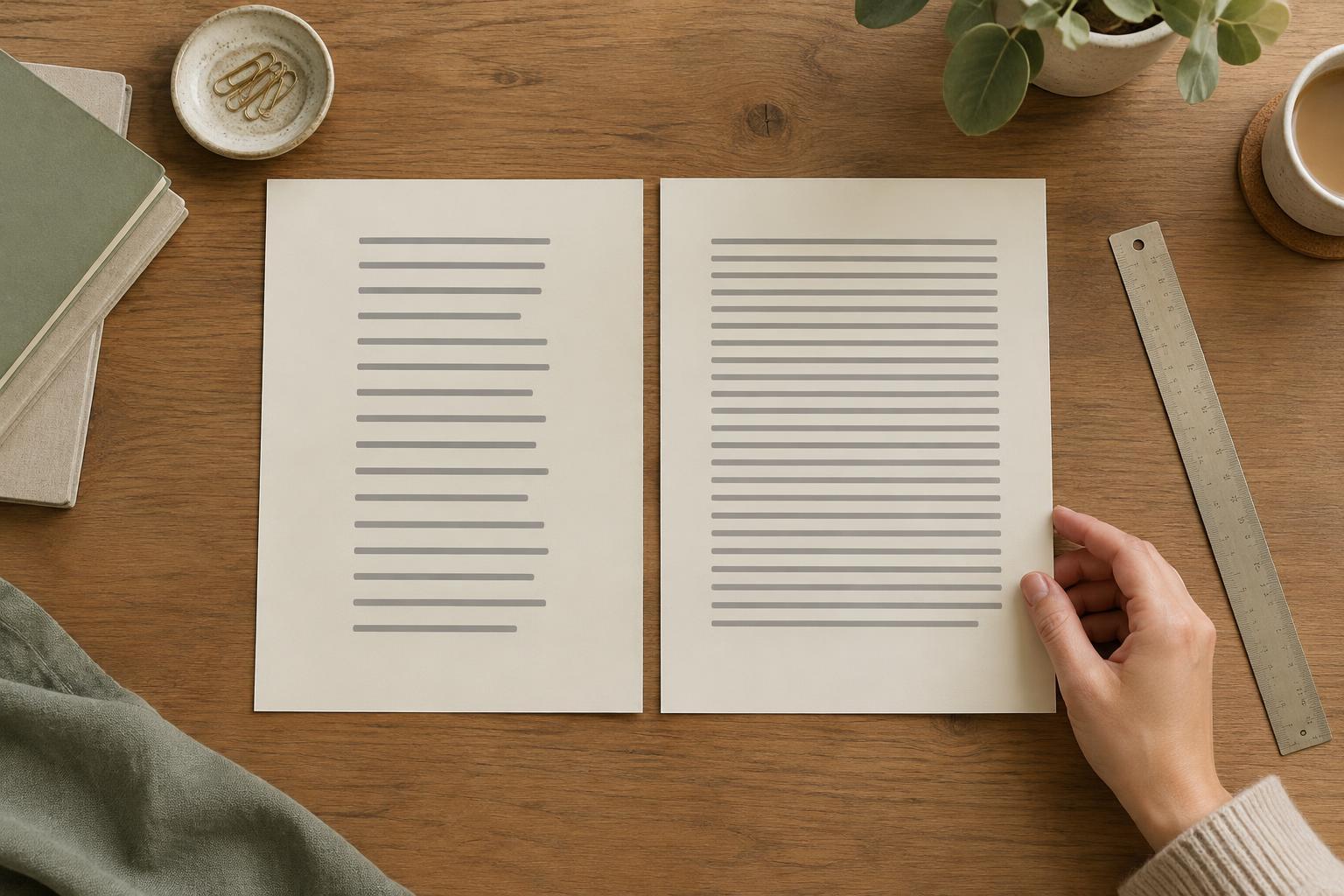
Layout and TypographyA readable paragraph depends on more than font choice. Learn how to adjust line length and line spacing together, then test the result in presentations, printables and digital layouts.
Read article · 4 min↗
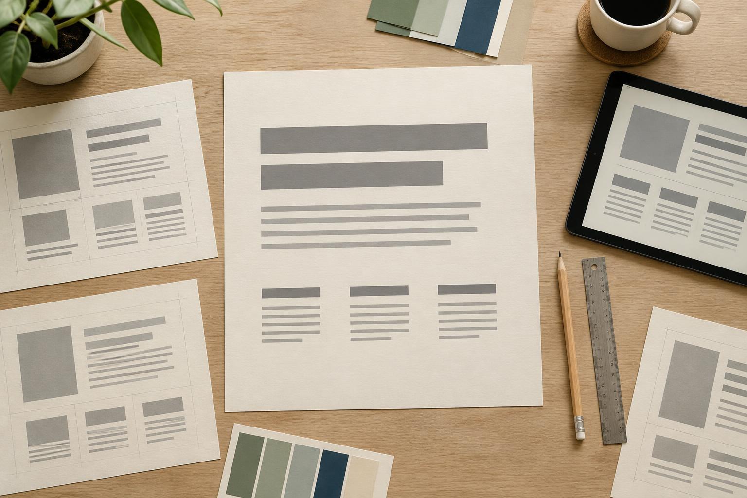
Layout and TypographyA type scale gives your text a clear hierarchy without making every line a different size. Learn how to choose a body size, build a small set of heading sizes, and test the result in presentations, planners, and digital layouts.
Read article · 4 min↗
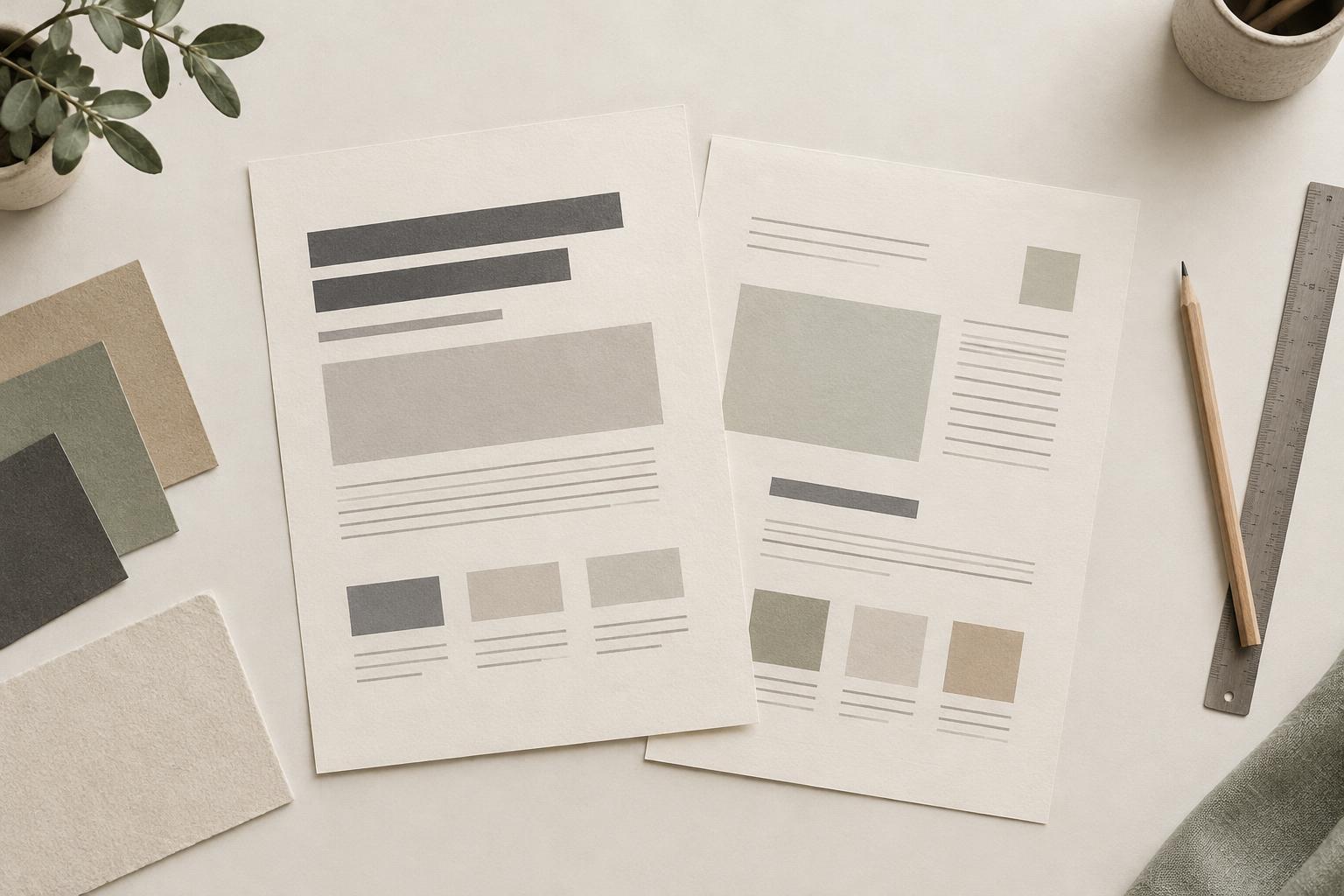
Layout and TypographyA good font pairing gives each typeface a clear job. Learn how to combine contrast, hierarchy and restraint so presentations, planners and social graphics feel easy to read rather than crowded.
Read article · 4 min↗
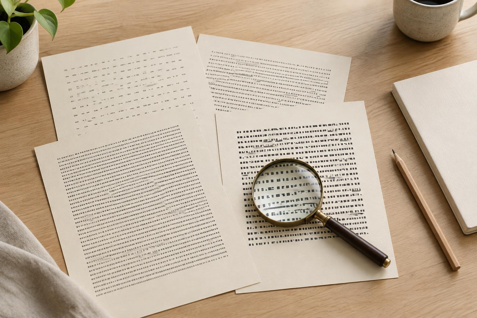
Layout and TypographyA readable typeface does more than look good in a font menu. Learn how to compare letter shapes, spacing and weight, then test your choice in real paragraphs, slides and printable pages.
Read article · 4 min↗
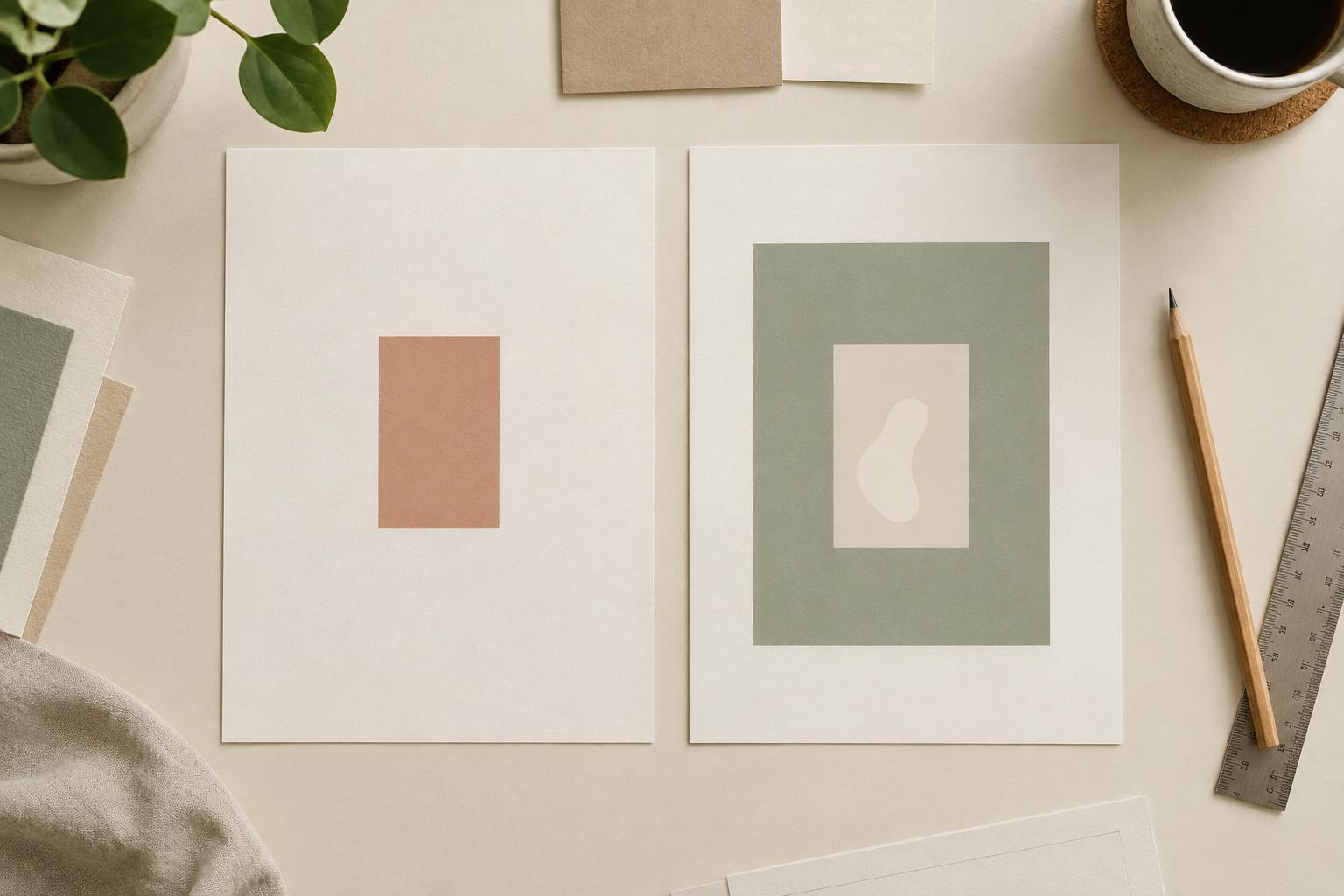
Layout and TypographyMargins separate an element from its surroundings; padding gives its contents room inside their container. Learn how to use both in presentations, planners and digital graphics without making a layout feel cramped or disconnected.
Read article · 4 min↗
Layout and TypographyWhite space gives text, images and controls room to work. Learn how to use margins, grouping and visual balance to make a layout feel calm and intentional rather than unfinished.
Read article · 4 min↗
Layout and TypographyThe space between design elements can clarify a page before anyone reads a word. Learn how to use proximity to group related content, separate different ideas, and make presentations, planners, and social graphics easier to scan.
Read article · 4 min↗
Layout and TypographyAlignment gives the eye a path through a design. Learn how to use shared edges, consistent spacing and a simple grid to make presentations, planners and social graphics easier to scan.
Read article · 4 min↗
Layout and TypographyA grid gives text, images and other elements a shared structure. Learn how to set margins, columns and spacing, then use them to create pages that feel connected without making every page look the same.
Read article · 4 min↗
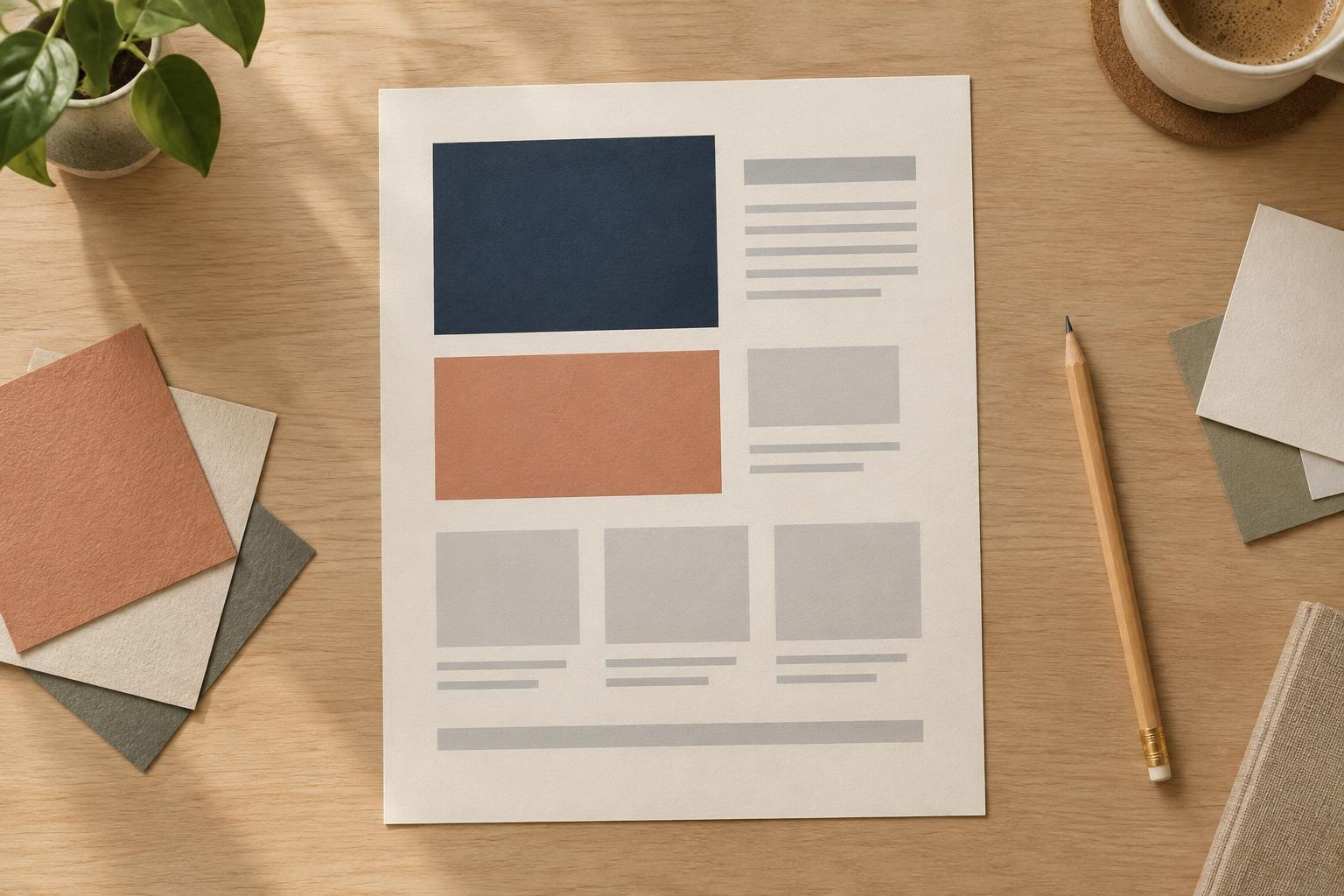
Layout and TypographyVisual hierarchy helps readers see what matters first and where to look next. Learn how to use size, type weight, and placement together to make presentations, planners, and digital graphics easier to scan.
Read article · 4 min↗