Start with the reader’s planning habits
A calendar’s first column may seem like a small design decision, but it affects every week a reader scans. A Sunday-start grid places the weekend at opposite ends of the row. A Monday-start grid puts Saturday and Sunday together. Neither is inherently easier to use; the better choice is the one that matches how your readers expect to find dates and organize their time.
Think about the planner’s main job. Someone using it for school or work may prefer a Monday start because the five-day routine reads as one block, followed by the weekend. Someone coordinating activities with a Sunday-start wall calendar may find a Sunday-start printable more familiar. If the planner is for a specific group, ask a few intended readers which layout they would reach for without thinking. Familiarity can matter more than a designer’s personal preference.
Consider what the week needs to show
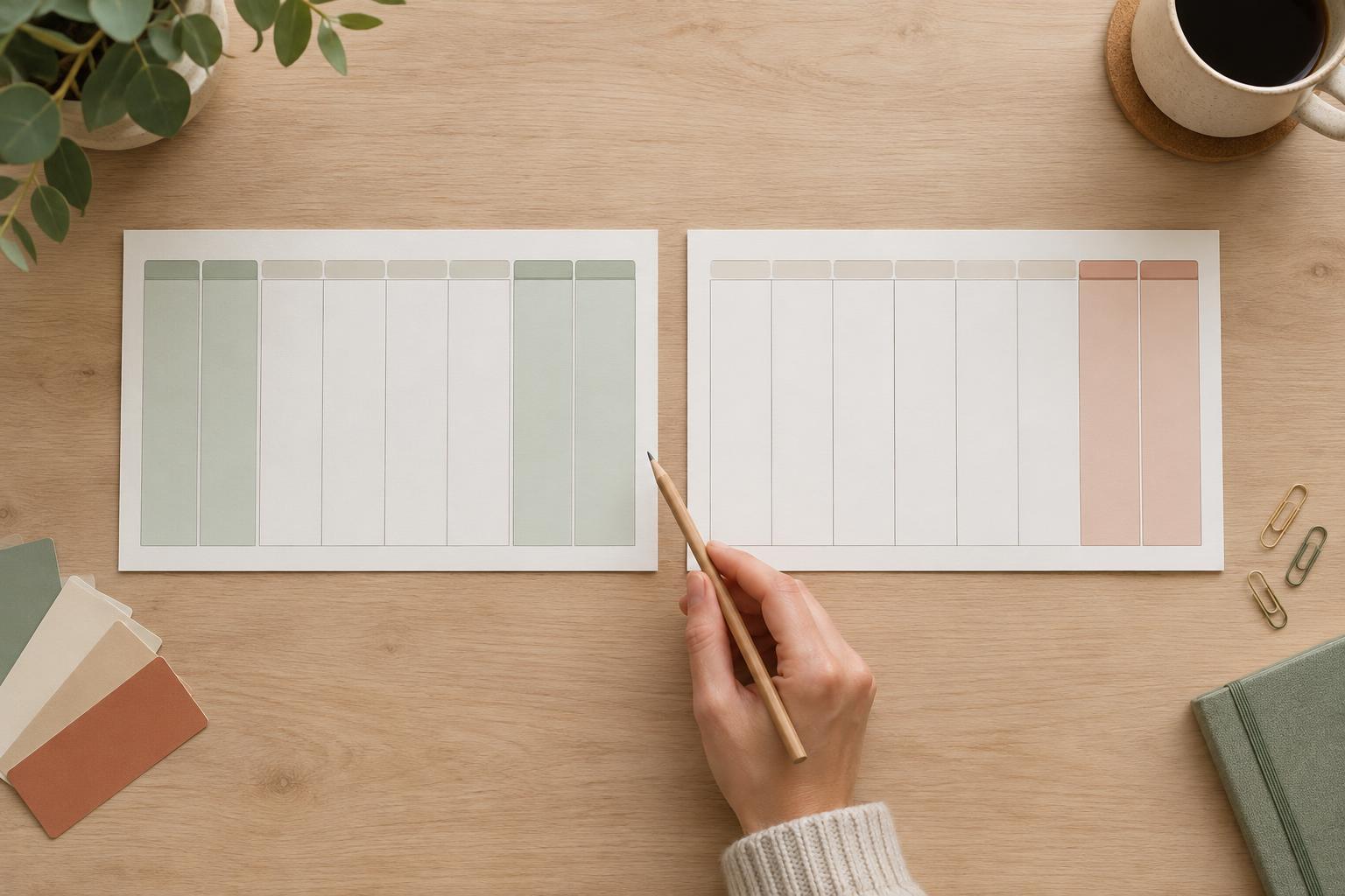
The strongest clue may be the information readers need to write down. In a weekly planner with separate workday and weekend spaces, a Monday start keeps the weekend together and makes it straightforward to give those two days a shared area. For a monthly calendar, either start can work well if every date has a clear, usable box.
Look closely at weekends before deciding. A Sunday-start monthly grid separates Saturday and Sunday, which can make a two-day trip harder to see at a glance. A Monday-start grid keeps them adjacent, but readers accustomed to finding Sunday in the first column may initially look in the wrong place. If weekend plans are central to the printable, sketch both grids with realistic entries, such as an appointment, a trip and a deadline. The version that makes those entries easier to follow is a useful guide.
Make the chosen order unmistakable
Whichever start you use, label all seven columns. Short day names can save space, but single-letter labels may be ambiguous: both Tuesday and Thursday begin with T, for example. In a compact calendar, consider two- or three-letter labels with enough room around them to remain legible when printed. A clear heading or small note such as “Weeks begin on Monday” can also help when readers are likely to use calendars in both formats.
Use color as a supporting cue, not the only way to identify days. A subtle background tint can distinguish weekends, while day labels and consistent column positions still carry the meaning in black-and-white printing. Check that lines, labels and writing spaces remain clear at the intended paper size. If one version needs narrower columns or smaller type to fit, adjust the surrounding layout rather than making dates difficult to read.
Build the dates from the week start, not from memory
Changing a calendar from Sunday-start to Monday-start is more than moving the weekday labels. Every date must shift to the correct column, and some months will need a different number of rows. If you are customizing a template, check the first day of each month against a reliable calendar for the year you are making, then review the final day and the dates around every row break. Pay particular attention to February and to months that span six calendar rows.
Test the finished printable as a reader would. Find a few dates by scanning down their weekday columns, write an event across a weekend, and print a page at actual size. This catches errors that are easy to miss on a screen: a date under the wrong day label, a cramped final row, or a weekend tint that looks too dark on paper. Keep one verified master layout so future pages inherit the same spacing and label style.
Offer both only when you can maintain both
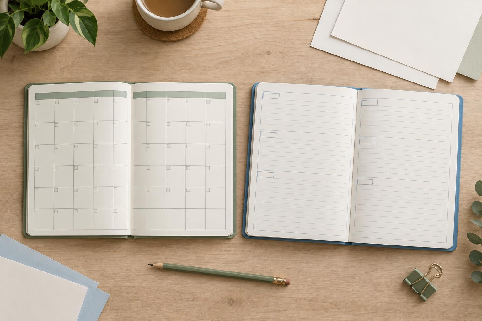
Providing two versions can be helpful when your audience has mixed preferences, especially for a reusable planner. Label each version clearly on the page or in its file name so readers do not have to inspect the first row to tell them apart. Apart from the day order and date positions, keep typography, writing space and page size consistent; that lets readers choose by habit rather than by an unrelated design difference.
Two versions also mean two sets of dates to check whenever you revise the planner. If that extra review is not practical, choose one start based on the intended readers and state it plainly. A carefully checked, clearly labeled calendar is more useful than a choice between two grids when one is prone to mistakes.